Hazard Risk & Map Layers
Japan is one of the most hazard-exposed developed countries in the world, and hazard exposure is priced into the market: it affects insurance cost, tenant demand, financing, and resale. Tatemono IQ overlays official Japanese government hazard data directly onto every property's map and summarizes it on the property panel, so you can read a site's disaster risk without leaving the platform or reading a Japanese hazard map by hand.
The Six Hazard Layers
Six hazard layers are available. All six are off by default and reset each time you load the page, so you turn on the ones relevant to the property you're evaluating.
| Layer | Icon | What it shows |
|---|---|---|
| Flood | a house in water | Projected river flooding: inundation depth at the location under the planning scenario. |
| Tsunami | a wave | Projected tsunami inundation depth for coastal and estuary locations. |
| Storm Surge | a wind swirl | Typhoon-driven sea-level rise pushing water inland. The icon is a wind symbol, not a water one. |
| Internal Flooding | heavy rain | 内水 (naisui): drainage and sewer backup during heavy rain, which floods areas that no river reaches. Distinct from river flood, and often the more relevant layer for dense urban sites. |
| Landslide | a slope with debris | Designated landslide hazard zones: steep-slope failure, ground movement, and debris flow. |
| Earthquake | a seismograph trace | Probability of strong ground shaking at the location over the next 30 years. |
The on-screen control is labeled Earthquake, while the property panel uses Seismic for the same underlying data. They refer to the same thing.
Using the Map Controls
The hazard controls live in the map's property panel. You'll find them in two places:
- On a property's detail page, where the panel opens by itself. The map on this page loads on demand: click Show map first, and the panel with the hazard controls appears with it.
- On the Properties list map, once you click a property marker to open its panel.
There are four controls:
- The six layer toggles: a 3×2 grid of icon buttons. They carry no printed labels, so hover a button to see its name in a tooltip, or open the legend, which names every layer you've turned on. Click a button to add that layer to the map; click again to remove it.
- Overlay opacity: a slider controlling how strongly the hazard colors sit over the base map. Turn it down to read street names and building footprints underneath.
- Clear all: removes every active layer at once. It appears in the Hazard Layers header only once at least one layer is on, so you won't see it on a fresh panel.
- Show legend / Hide legend: opens and closes the color key described in the next section.
One layer behaves differently: Earthquake depends on an external service, and after you turn it on, its button can appear greyed out with an explanatory tooltip if that service is unavailable. The other five layers have no equivalent state.
Reading the Legend
Open the legend to see what the colors mean. It lists one block per layer you've turned on, each headed by that layer's name, so the legend is also how you confirm which layers are active. Four of the six layers share a single depth scale, described once below.
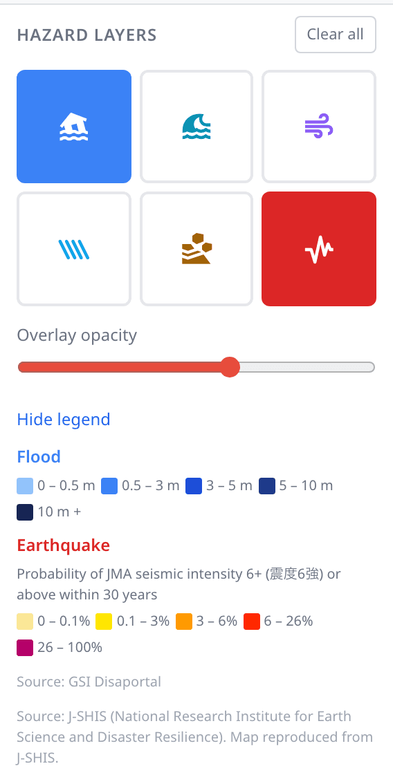
In the screenshot above, Flood and Earthquake are both active, so the legend shows a depth scale for Flood, a probability scale for Earthquake, and the source line for each. A Clear all button sits in the header because at least one layer is on.
The shared depth scale. Flood, Tsunami, Storm Surge and Internal Flooding all measure the same thing, expected inundation depth in metres, and share one five-step color ramp:
- 0 – 0.5 m
- 0.5 – 3 m
- 3 – 5 m
- 5 – 10 m
- 10 m +
Depth matters more than the presence of color. Half a metre is a cleanup; three metres puts the entire ground floor underwater and determines whether a ground-floor unit is rentable at all.
The earthquake probability scale. The Earthquake layer has its own five-step ramp, and it measures probability rather than depth: the chance of JMA seismic intensity 震度6強 or stronger shaking at that location within 30 years:
- 0 – 0.1%
- 0.1 – 3%
- 3 – 6%
- 6 – 26%
- 26 – 100%
Landslide shows zones, not depths. The landslide overlay marks designated hazard zones: steep-slope failure, ground movement, and debris flow. The color scale shown under the Landslide heading is the depth scale used by the water-based layers; it does not describe landslide zones and can be ignored for this layer. What matters is whether the property falls inside a marked zone.
The Property Hazard Panel
Alongside the map, each property carries a Natural Disaster Hazard Risk Assessment section that summarizes all six hazards as cards. Each card shows a colored risk badge, and cards with data expand to show the underlying figures: inundation depth and water retention time for the water hazards, tier and probability for earthquake.
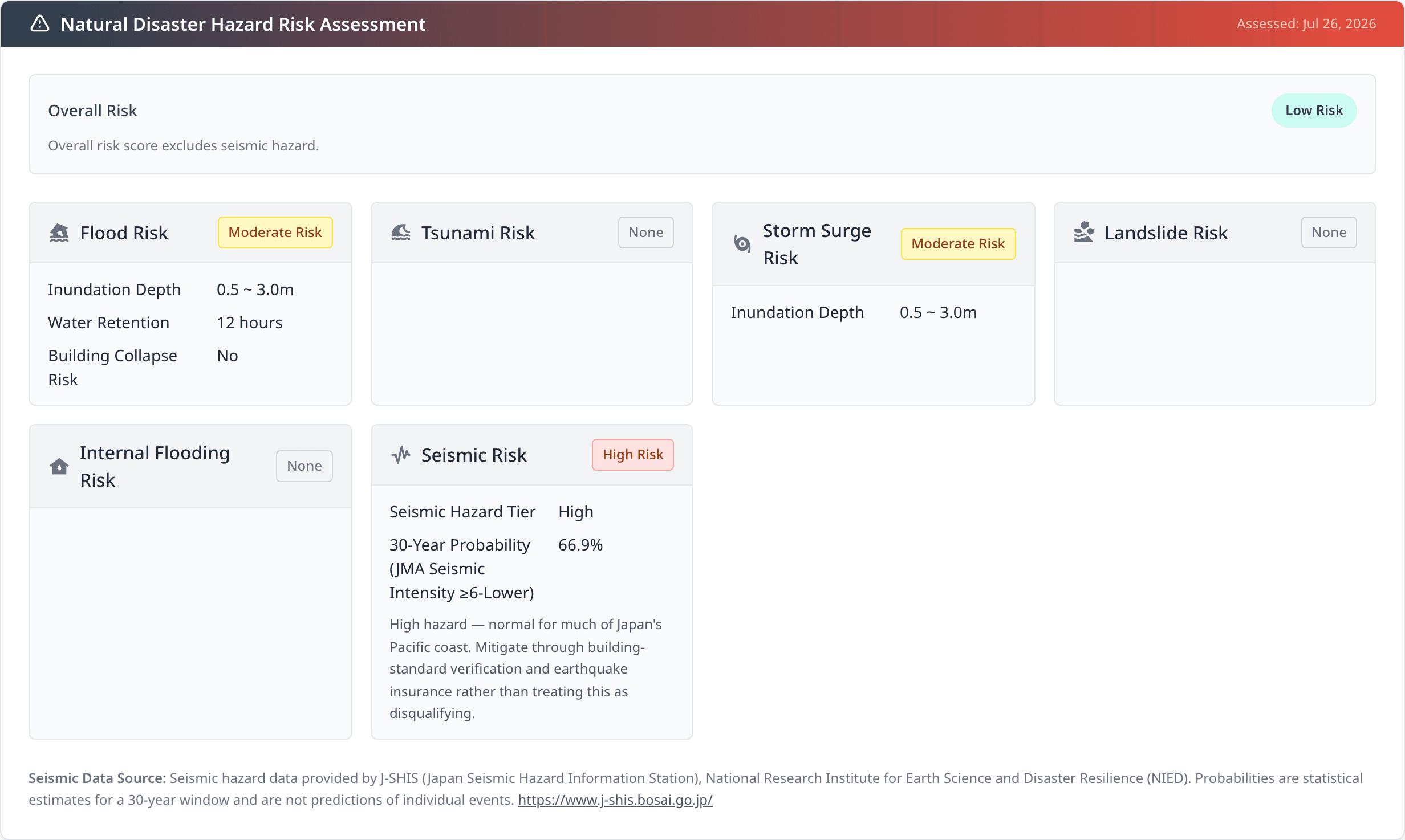
The property above carries a Moderate flood and storm surge reading, no tsunami, landslide or internal flooding exposure, and a High seismic reading, with an Overall Risk of Low. That combination is explained in What the Overall Risk Score Includes.
Two things to know about where this section appears:
- It needs a saved property, so it isn't there while you're still entering a new one. Import or save the property first.
- Land-only records don't show the hazard section on the Building tab, since the building-focused view doesn't apply to them.
Seismic Tier and 30-Year Probability
The Seismic Risk card carries two fields that the other five hazards don't have.
30-Year Probability is the underlying figure: the modeled chance of strong shaking at this location in the next 30 years. Seismic Hazard Tier groups that figure into four bands:
| Tier | 30-year probability |
|---|---|
| Low | under 3% |
| Moderate | 3 – 6% |
| Elevated | 6 – 26% |
| High | 26% and above |
The badge and the tier are on different scales; this is not a bug. The colored badge in the card header uses the same five-level vocabulary as the other five hazard types, so the four seismic tiers are mapped onto it: both Elevated and High tiers display a High badge, and Moderate displays a Medium badge. The tier row carries the finer-grained reading, so a property showing "Elevated" beside a "High" badge is behaving correctly; read the tier row for detail.
A high tier is not a reason to walk away. Much of Japan's Pacific coast, including most of Greater Tokyo, sits in the High band, and the platform says so on the card itself: "High hazard — normal for much of Japan's Pacific coast. Mitigate through building-standard verification and earthquake insurance rather than treating this as disqualifying." The practical response is to check the building's construction standard and to price earthquake insurance, not to exclude the location. A High seismic tier tells you what to verify next; it does not rank the property against alternatives, because nearly every alternative in the same region carries a similar figure.
Location Shaking vs Building Era
"Seismic" describes two separate things in Japanese real estate, and they are easy to conflate:
- Location shaking hazard: how strongly the ground at this address is expected to shake. This is what this page describes, and it comes from the national seismic hazard model.
- Building 耐震 standard: whether the structure was built to the current earthquake code. Buildings permitted before the 1981 revision (旧耐震, kyū-taishin) were designed to a weaker standard than those after it (新耐震, shin-taishin).
These pair; they are not two readings of the same thing. A 新耐震 building on high-shaking ground and a 旧耐震 building on low-shaking ground are genuinely different risks, and you need both facts to judge either. The hazard data on this page answers the first question only; the building's era and structural condition come from the property's own records and from due diligence.
Two Different Shaking Thresholds
The map legend and the property panel both report a 30-year probability, but they measure different shaking thresholds, so their numbers will not match for the same location:
- The map's Earthquake layer measures the probability of 震度6強 (JMA intensity 6-Upper) or stronger.
- The property panel's 30-Year Probability measures the probability of 震度6弱 (JMA intensity 6-Lower) or stronger.
6弱 is the lower bar of the two (any shaking that reaches 6強 has also passed 6弱), so the panel's figure is the larger number for any given site. Both are correct; they answer slightly different questions. If you're comparing the two, compare like with like: use the panel figure for the property's own reading, and the map layer for how that site compares with the surrounding area.
For scale: 震度6弱 is shaking that makes standing difficult, moves heavy furniture, and cracks walls in lower-standard buildings. 震度6強 makes it impossible to stand and can collapse buildings that don't meet current code.
What the Overall Risk Score Includes
The Overall Risk reading at the top of the hazard panel is computed from five hazards (flood, tsunami, landslide, storm surge and internal flooding), weighted by severity. Earthquake is not part of it.
This is why a property can show a Low overall risk beside a High seismic reading, as the screenshot above does. Nothing is contradictory: the overall score is summarizing water and landslide exposure, where that property genuinely scores low, while the seismic reading is reported separately on its own card.
The reason for the separation is that seismic hazard barely discriminates between properties in the same region; folding a figure that is High across all of Greater Tokyo into a comparative score would flatten the differences you're actually trying to see. So read the two together: the overall score for comparing sites, and the Seismic Risk card for the earthquake picture. The seismic data is fully present and assessed; it simply isn't blended into that one number.
When the earthquake reading is Moderate or above, the panel states this directly beneath the overall score.
Data Sources and Limitations
All hazard data is official Japanese government data, from two different sources:
- The five water and landslide layers come from the GSI Disaportal (国土地理院 ハザードマップポータルサイト), served as map imagery.
- Earthquake data comes from J-SHIS (Japan Seismic Hazard Information Station), published by the National Research Institute for Earth Science and Disaster Resilience (NIED). See www.j-shis.bosai.go.jp.
Attribution lines appear in the legend only while a layer from that source is active, which is why the source text changes as you toggle layers.
Because earthquake data arrives through a different pipeline than the other five, it behaves differently in two visible ways: it is the only layer with an availability state, and it is published at a coarser resolution: the overlay stops drawing at very high zoom levels, so zoom out if the layer disappears while the others stay visible.
Four limits are worth stating plainly:
- Seismic probabilities are statistical estimates over a 30-year window, not predictions of individual events. A 66.9% figure does not mean an earthquake is scheduled; it means the model puts that likelihood on the threshold being crossed at least once across 30 years.
- Seismic data is modeled on a roughly 250 m mesh, so it describes a neighborhood rather than a single building footprint. Two properties on the same block share a reading.
- Hazard mapping describes the site, not the structure. It cannot tell you how a specific building will perform; that depends on construction standard, age, ground conditions on the parcel, and maintenance.
- None of this substitutes for the 重要事項説明 (statutory disclosure) a licensed agent must provide before purchase, or for professional inspection and survey. Use it to shortlist and to decide what to investigate; verify before you commit.
Next Steps
- Browsing Properties: the map, the property panel, and the neighborhood tools around them
- Running AI Analyses: evaluate a property once you've read its hazard profile